Alien
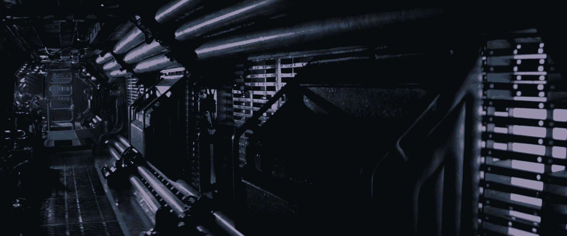
It’s not a news, the introduction sequence of Alien is remarkable. Ridley Scott decided to spend a few minutes of the film wandering in an empty spaceship.
The story unfolds from an unanticipated wake up, but we just witness what is not happening before the event.
The sequence showcases the amazing production design: the industrial art by Ron Cobb, the icons (and more) designed by Moëbius. Even if they used technologies from the time of the filming, like CRT screens, this aesthetics became timeless, kind of retrofuturism.
The production was so thought and the fact that the director took the time to share and enjoy the art of the design team is wonderful.
It’s shorter than I remember, just three minutes in reality, but became iconic.
Back to the Future
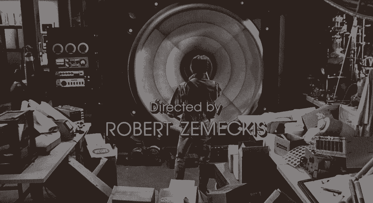
The cinematography is splendid, the type design of the credits is ageless, the long shots are mastered, it's Zemekis of course. He's not afraid of cutting the long takes when needed.
The sequence is foreshadowing the plot, portraying the characters while depicting the film's subject: the time. And the scene ends with an explosion of 80s Power of love and skateboard.
Speed Racer
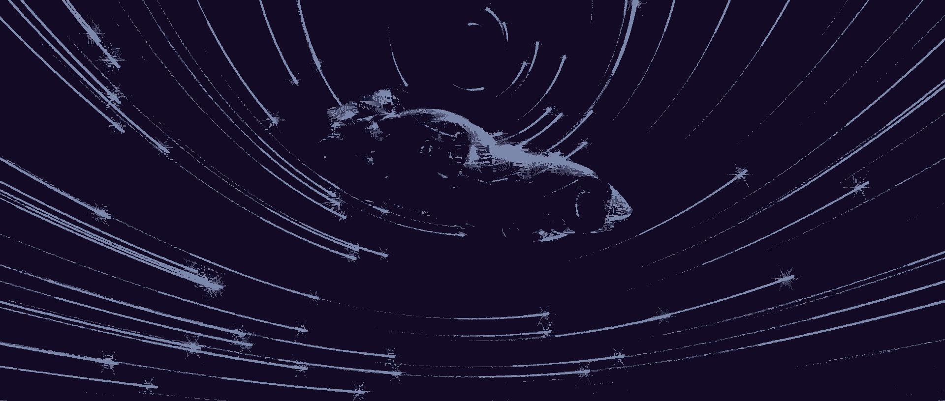
The Wachowskis proved their editing skills with Cloud of Atlas and Sense8 where the stories stay clear even if they jump between timelines, time zones and characters. But the introduction of Speed Racer is still their most flamboyant example.
Alternating between a present scene where Speed is racing against his big browser’s ghost, figuratively because he left the family and literally as a video game race ghost like and flashbacks presenting Speed.
The -flawless- alternation is classic but the most vivifying thing is the crescendo. The tension is building up and I'm just hooked until the last part. Tough to follow up on this but the film is showing incredible resources.
The sequence is 17 minutes non-stop of introduction to the characters and their traumas and to the unique and unconventional film style, all this during a race. Everything the film is about: race for family and respect.
As the first film of the duo after Matrix, it's a direct hit in the jaw, without any foreplay.
Booksmart
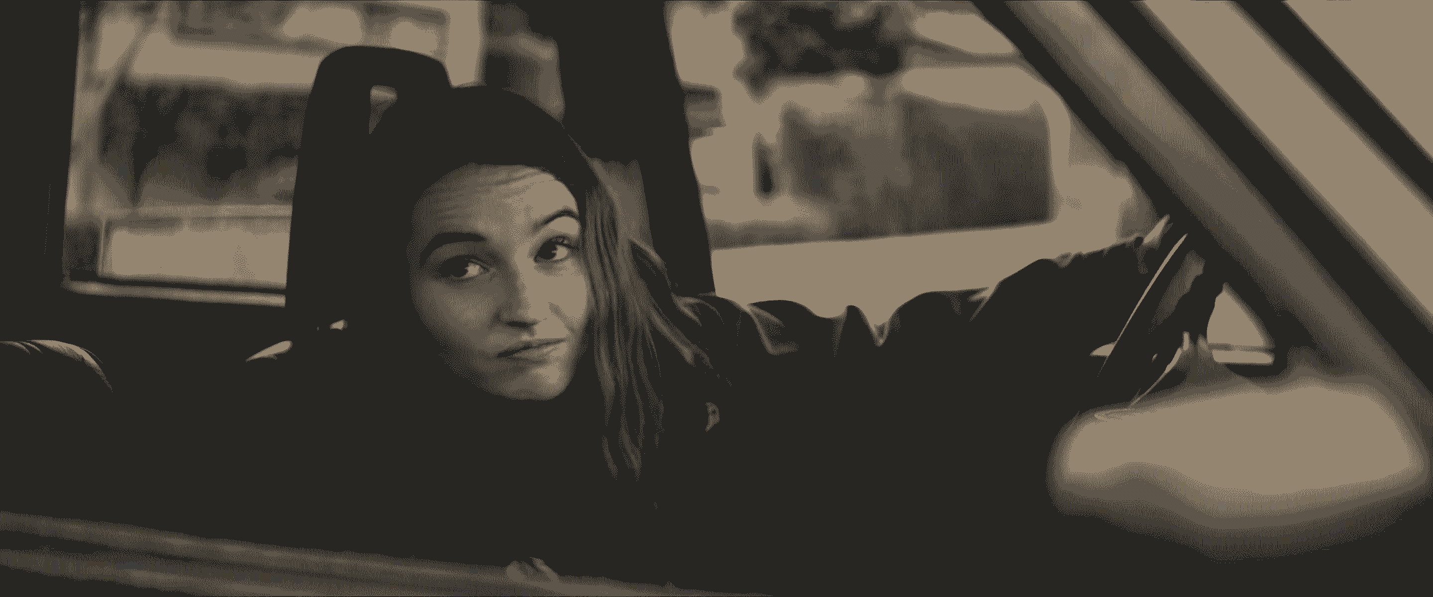
I just love the lines from Amy (Kaitlyn Dever) in the car and how she delivers them, and the stupidly free dance moves after. The short cameo of Maya Rudolph is the cherry on the cake.
Every time, I'm just watching the introduction, I can’t stop until Billie Lourd is yelling, "Keep it down out there!" a few minutes later.
Kung Fu Panda
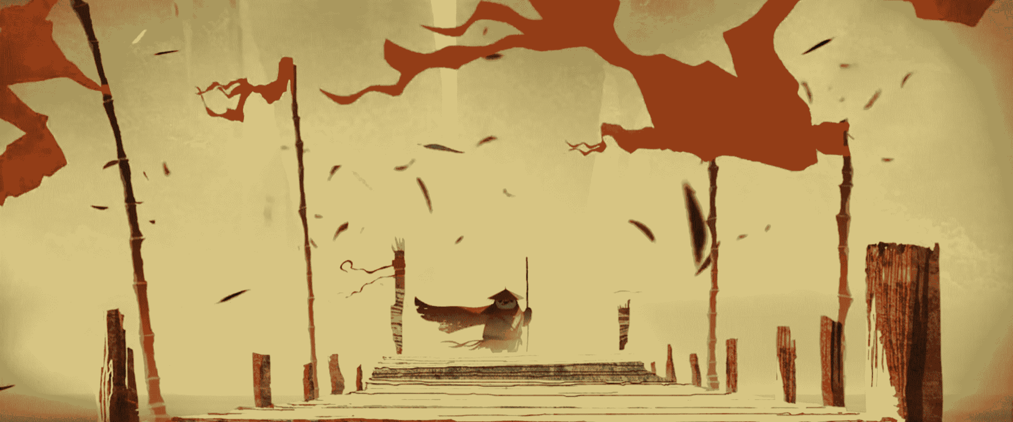
I'm a geek for animation and I was in art school when the film came out. I studied this animated introduction and try to copy it. It reminds me the work of Genndy Tartakovsky on Samurai Jack but with even more time and/or budget. This balance between traditional 2D animation and computer particles and clothes animation has been rarely matched.
This intro just overcame the rest of the film, which aged poorly in comparison. It was high quality but that's the problem with 3D animation.
Reservoir Dogs
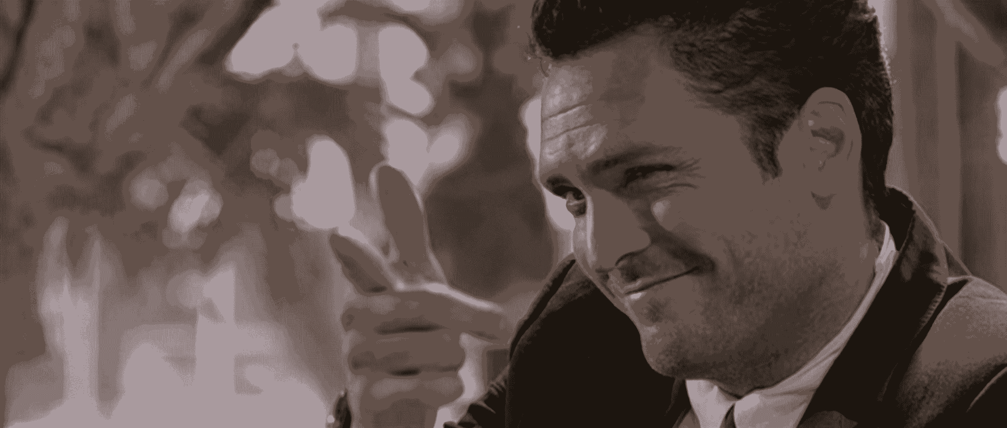
I don’t tip and back then, when I watched the film, I didn’t even know what a tip was but this debate about tipping stayed with me until today. This mundane talk with random people starts like a down-to-earth movie until the opening fades into Mr X bleeding and moaning in the backseat.
Only small details can give up the gangster side of the group: the suits, Mr Pink, the killing joke.
The cult opening of the men in black walking in the alley with a bad slow motion inspired so many. Easy to find it on a tee-shirt.
Amazing to see that the Tarantino openings aesthetic is already in place.
The Graduate
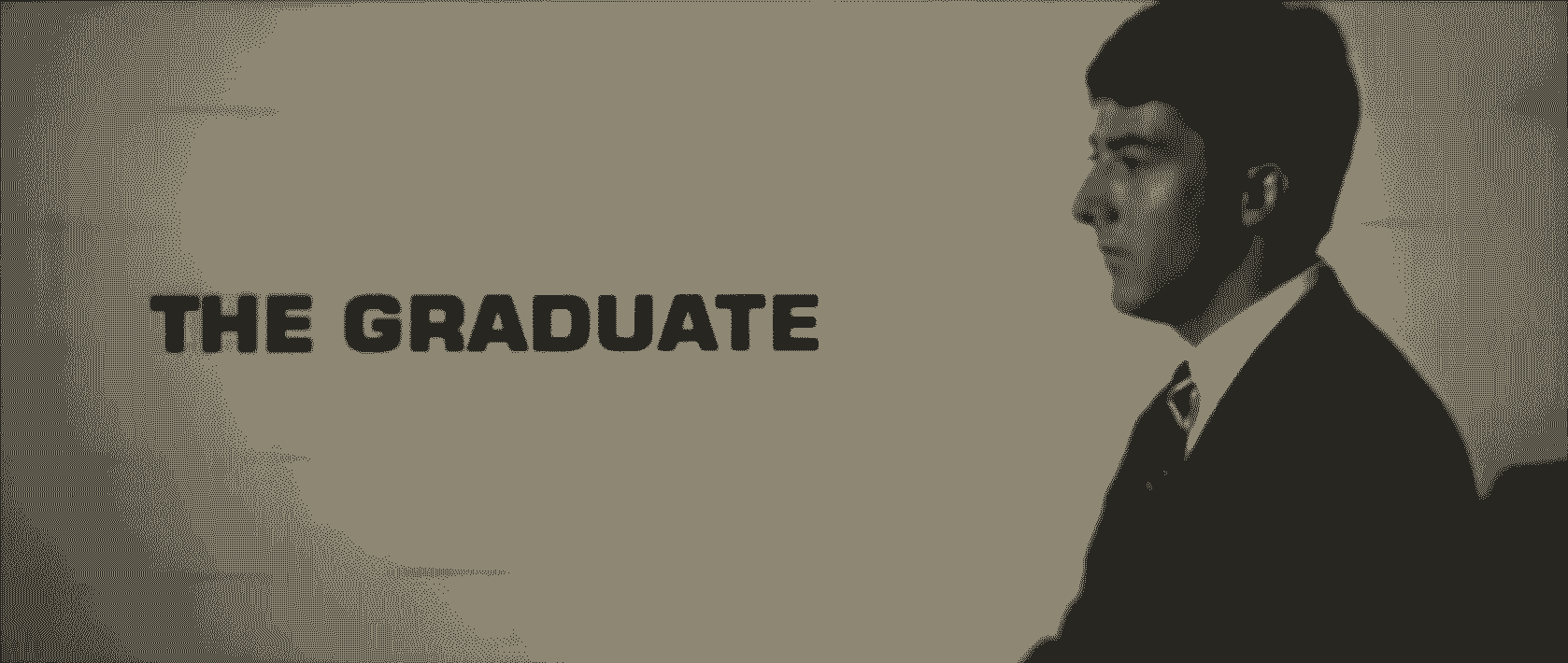
Tarantino has so many memorable opening scenes but the travelling from Jacky Brown resembles the opening of The Graduate (1967). Simon & Garfunkel's music, a zoom out shot in the plane and "one shot" on the moving walkway.
And the film ends with an incredible last shot, mixing hope, jubilation and meaninglessness, reprising the Sound of Silence.
Arrival
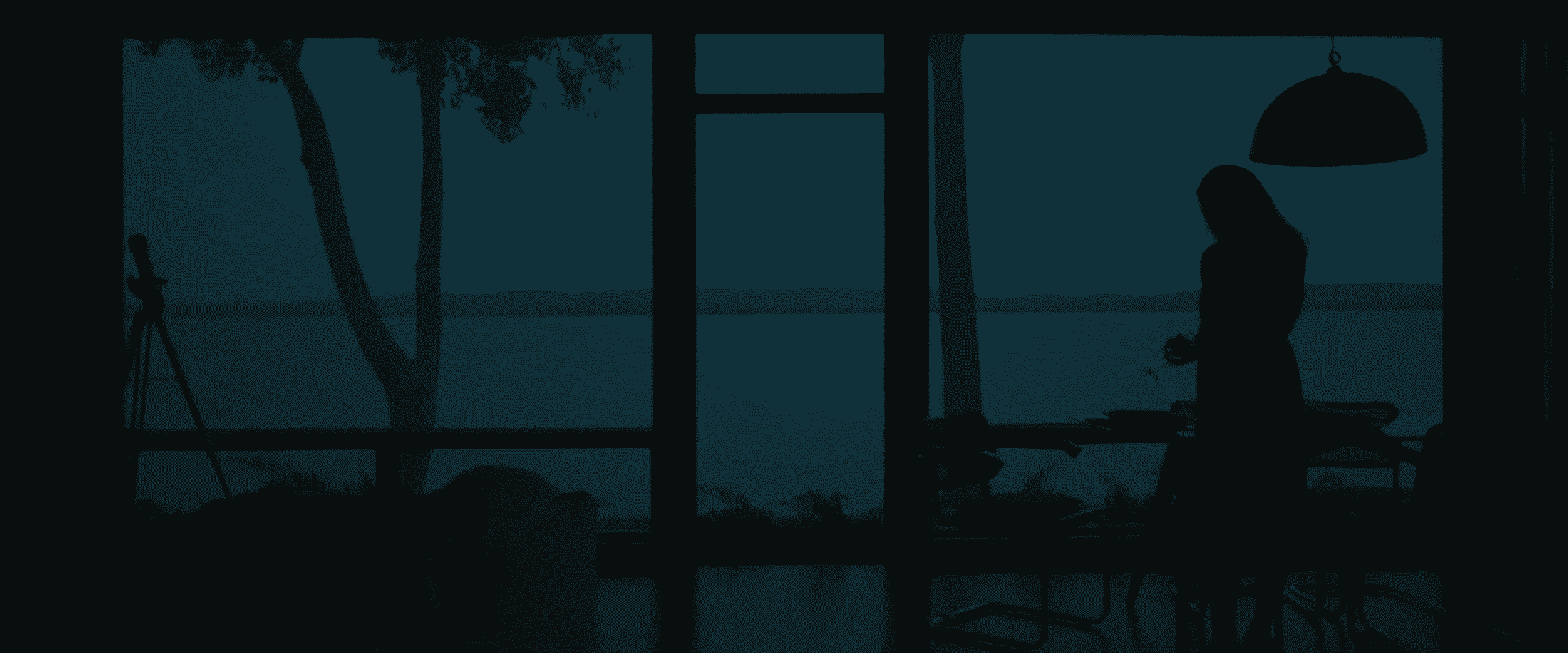
Another example of mirrored music, this time with Max Richter.
The trivia is that it was a temp track but none of Jóhann Jóhannsson’s attempts convince Villeneuve to replace it.
The end reflects the beginning with the same shot, same music. It’s an easy way to close a story but matches smartly the concept of the alien language in the movie.
Mr Right
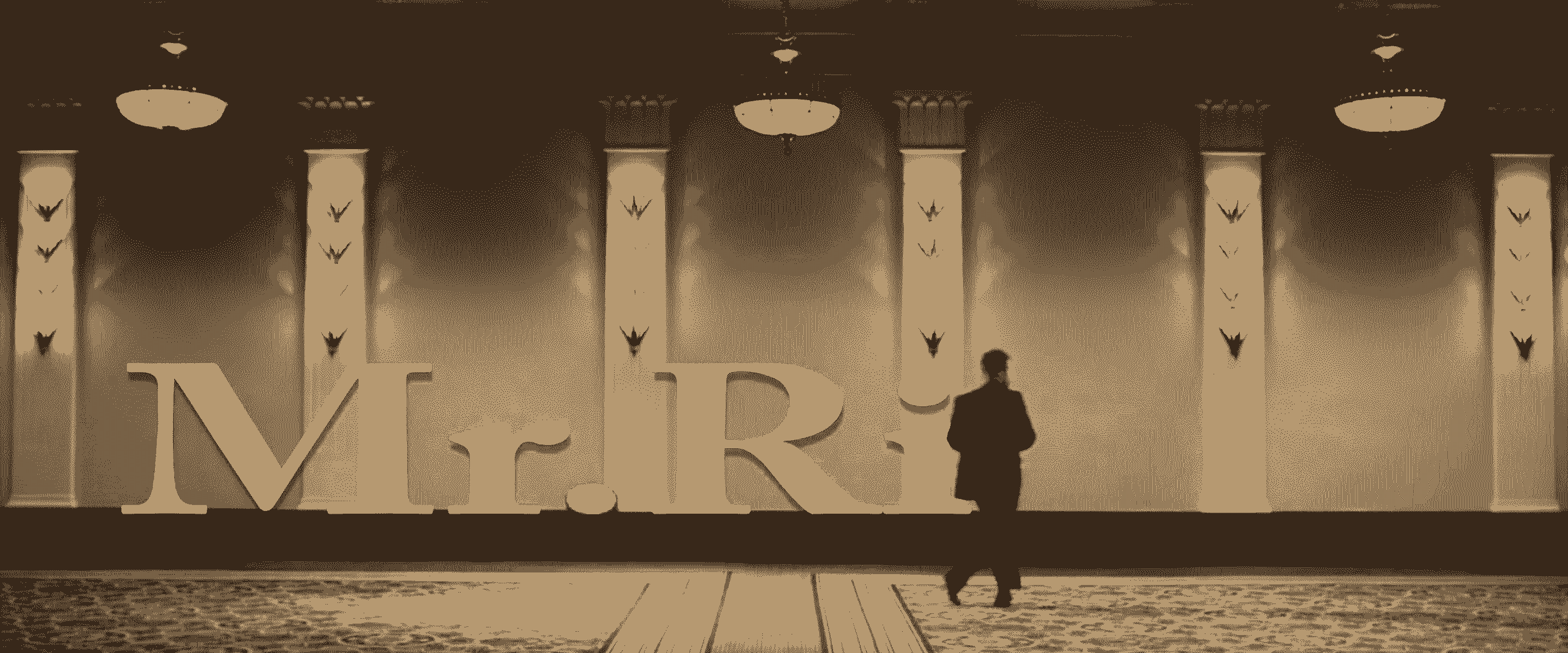
This music is magic, perfect to wake up in a good mood, and Sam Rockwell's dance moves are pretty nice.
And …
I also think about Apocalypse Now and The Door’s This is the end. Funny for an intro, which is not funny at all.
The opening credits mixing music and slow motion of Watchmen. It’s almost the only original addition in this straight up adaptation of the comics.
I love the soundtrack by Daft Punk for Tron legacy. Weirdly, my favourite part of the film is everything outside the computer world and mainly the beginning, the instalment of the story and what happens since the first episode.
Conclusion
I took the luxury to skip the introduction in a post about introductions but I'll try to conclude.
The opening has to deliver the keys to comprehend the universe of the fiction. It has to introduce a tone, a style of narration, a world with its own new rules, characters and places.
It can be silent or dialogue heavy, truthful to the rest of the movie or not, personally, if I'm not hooked after it, it’s missing the point.
All films introductions I like hold the core feeling of what the film wants to tell: a hero’s dream or despair, a a yet untold world to explore, ….
Convey this very essence while welcoming the spectator is the purpose of the introduction.
Fin