This a translation of an article first published, in French, on the 19th of December 2020 for 24joursdeweb.fr.
I’m lead developer on moooi.com website since two years in the agency Build in Amsterdam, based in ... Amsterdam. I will try to share some knowledge I learnt during this project in this article. Accessibility was a new requirement for me, on top of the most complicated website I’ve done but this didn't lower our ambitions.
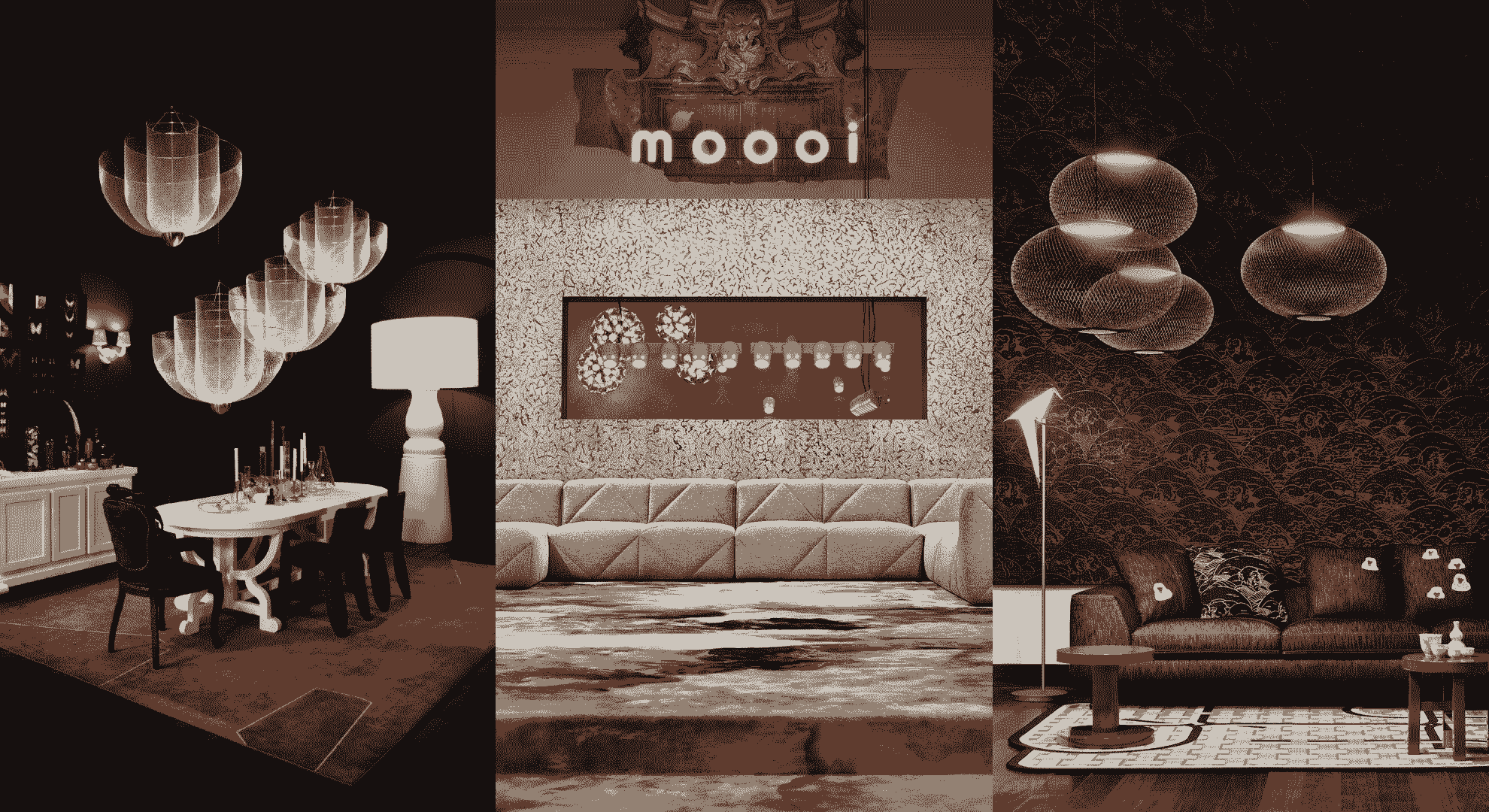
Moooi is a Dutch high end furniture company that concentrates a family of designers creating extraordinary products. There are multiple brick and mortar stores around the world and it’s from the one in New York that the obligation of accessibility came more than two years ago. We are seeing the same raise of concerns around accessibility from our others clients, Suitsupply, adidas or Reebok.
Moooi is the most intricate project I’ve worked on. Manifold types of products (simple, variable, bundles, configurable), multilingual website, B2B features, internationalization (multi currency, multi units), multiple stock management, a lot of product's technical specs (country specific certifications, packaging dimensions, electrical, materials and fabrics), customisable homepage, product pages and story pages.
But a11y was the most original and welcome requirement. Of course, as a frontend developer, I was already considering it, but it has never been part of the briefing, from the client.
The goal was to refund the e-shop with a new visual identity and to make it accessible following WCAG 2.1 AA.
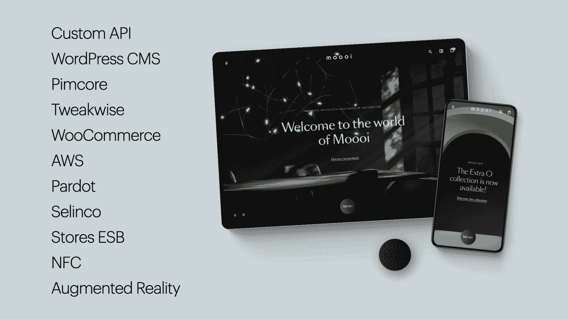
The website is using WooCommerce to handle products and orders et WordPress for the editorial. It's a CMS that we know very well, I'm working with it since 2010, and it can be heavily customised.
The frontend of the website is developed with React and Redux. The server side is Node.js with Express.
To follow accessibility guidelines, we are using a lot of tools described by David Dias in his article Outils et astuces pour rendre accessible et performante son application React (in French).
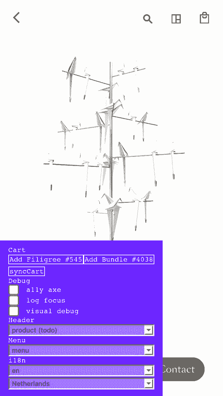
In particular, eslint-plugin-jsx-a11y or react-axe module that is running a live audit of the website and displays the errors directly in the browser console, with a top of the class documentation. But this has a cost and impacts the performance. It's impossible to work properly on animations while the module is running so we added a switch in a custom dev panel, like dat.GUI. It's sadly more than common to forget to enable it again.
But the best help didn't come from any packages of npm.
The Human Show
Starting July 2019, we had meetings with the consultant from The Accessibility Foundation, based in Utretch, Pays-Bas. First of all to get feedback on design deliveries, then, quickly, also for technical questions.
Next, we organised reviews of the first developed pages, sometimes with temporary content, by the same consultant to prepare the audit planned for December.
In January 2020, the result of the first audit from The Accessibility Foundation was encouraging but, despite our efforts, some errors kept us from getting a perfect score. After asking more details on some points, our contact told us that he disagreed with the audit’s author on one specific point.
It’s a good example to remind that it’s not a mathematics exam, the human factor is very important in the interpretation of the rules and the uses cases are numerous.
Our errors were mainly oversights or mistakes:
- title attribute missing on the SVG logo
- one missing alternative text on a video
- a non semantic use of the tag
eminstead of styling with CSS - wrong values for the
autocompletevalues on form inputs - wrong interpretations on the hierarchy of the content. It’s sometimes complicated to find the logical sequence of headings when the layout is funky. The simplest rule to follow is that the hierarchy is strict:
h3is not possible before ah2.
The second audit, in February, revealed a few errors left but it gave us one week to fix them before a complementary audit.
Third time’s a charm! I was so relieved and proud to finally pass the test that I printed the page showing the 50/50 mark to decorate my desk.
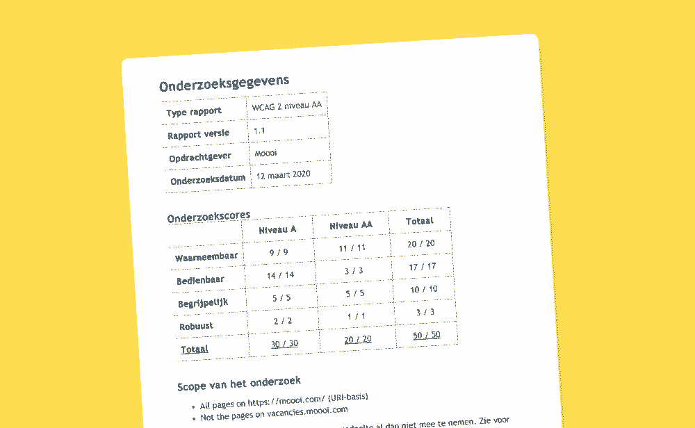
We should not forget that these audits are not absolute certificates. The website is evolving every days with content publishing and code updates. Although, it’s a meaningful proof that externals experts audited it.
The Customisation of Jesse James
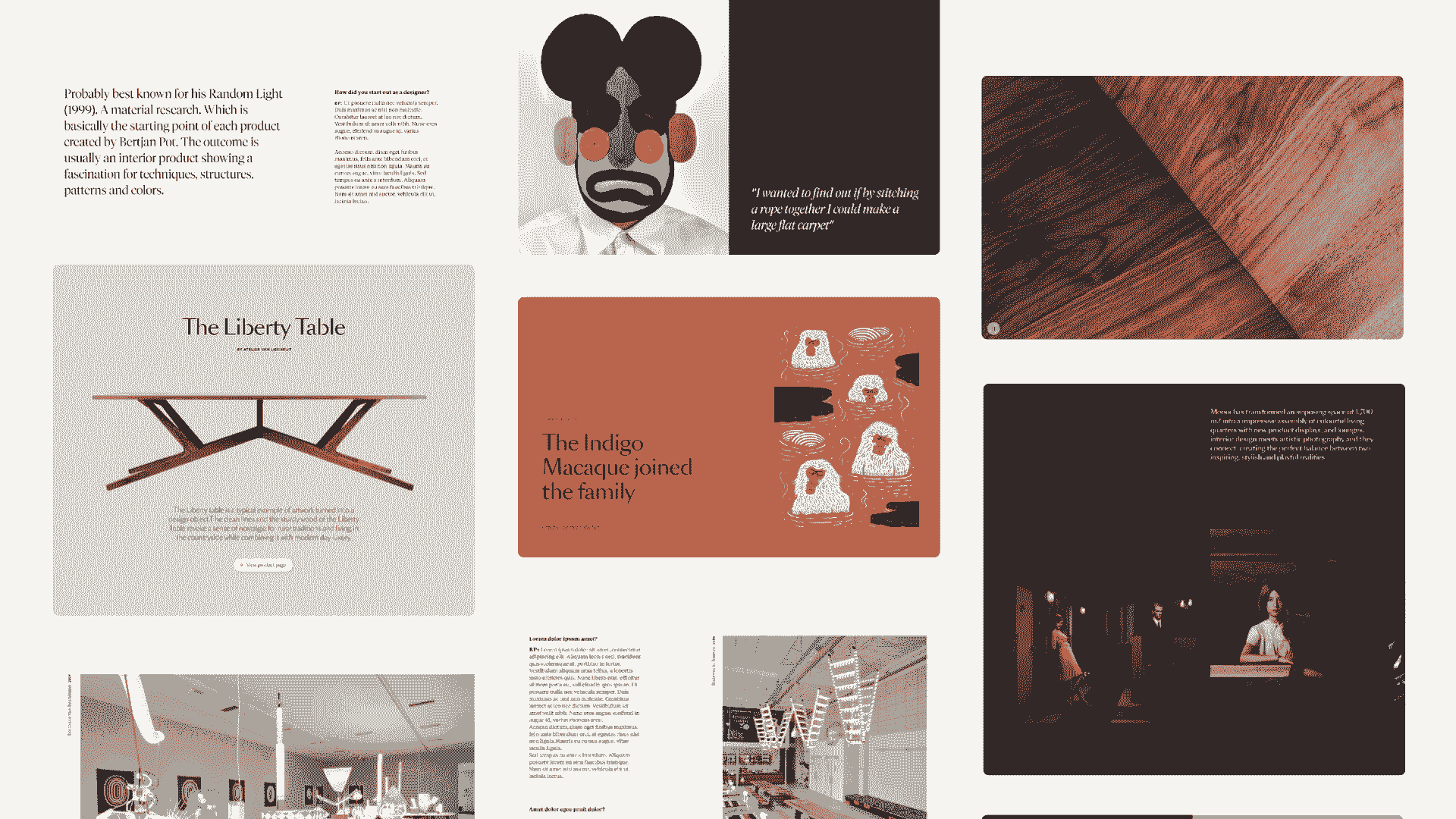
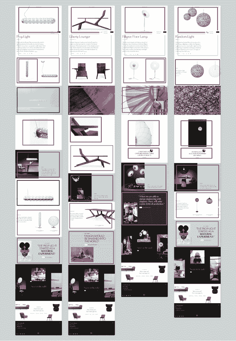
Customisation of editorial content was a big challenge, on the homepage or in the stories.
We added many settings in the CMS to create uniques blocks: you can change layout, fonts, image, video, copy and animations.
Maintaining readability and contrast of the text above photos or videos are always complicated.
It’s impossible to automatise the process, especially on video, so we put a manual option to select a light and dark theme on every block, to darken the media if the text is in white. We have developed a preview of the block in WordPress UI to help the editors.
Other tip, I would not recommend to have a fixed transparent background header if you want to avoid readability issues. On Moooi, we use the theme from every block to update the color of the header when displayed above it.
Tabman Forever
Before this project, I was only considering keyboard navigation on forms, and mostly for power users, like me. But we should manage focus and tabindex through the all website to offer a functional keyboard accessibility. It is very easy to test with the tab key on your keyboard, even if the results may vary depending on the browser and/or operating system: I had weird experiences on Firefox/macOs so I was testing on Chrome.

To facilitate debugging of the focus, we log in the console the document.activeElement on a click or when the esc or tab key are pressed. This way, we can track, even the hidden, focusable elements.
The focus state must be visible for the users navigating solely with keyboard but we don’t want to bother users with mouse or other pointers.
:global(.js-focus-visible) &:focus:global(.focus-visible) {
    outline: 1px dashed $light_grey;
}
A component that required special attention to handle correctly the keyboard navigation was the main menu.
The Curious Case of Benjamain Button

The main menu button embodies the will to hide complexity behind simples things.
It’s an echo to brick and mortar stores because each products has a NFC button, invented by Moooi, to prove their authenticity.
The menu button is placed at the bottom of the screen, contrary to the classical burger menu, for an easier use on mobile devices and it’s big enough to be noticed and manipulated. For a better a11y but also to make it more fun and “physically real”, you can click and drag it on other corners of the screen, to content lefties and righties.
Developed with React UseGesture, it has been my first experience with React Hooks. The project mixes class components and Hooks. It works very well but requires a bit of mental gymnastics.
The Button is also multifunctional and serves as an audio player if an article, product or designer has an audio track.
An interesting WCAG directive is the requirement to be able to access content in more than one way. Usually a link in the menu and search or a sitemap. The menu therefore offers a search form that displays results from a third-party service: Tweakwise. Very fast and optimisable.
To offer as many as possible entries, we added a voice search thanks to the Web Speech API in Google Chrome. It is not available in other browsers but doesn’t ask for much work to implement. For the users, if their devices is not compatible, the feature is not displayed. This is just a bonus.
In the same fashion, to show the products in Augmented Reality, we are using the solutions from the mobile operating systems: AR Quick look on iOs and Scene Viewer on Android. The development effort is minimal and accessibility is covered. Quick Look supports Voice Over, for example. We are trying to reduce the gap between IRL and digital shopping.
This led us to develop a tool that allow users to compare each product with other objects to grasp the size, often surprising, of lamps or other sofas. The implementation is simple: CSS percentages to manage the size of the two objects. With different positioning for suspended or floor-standing products.
On the other hand, this comparison tool is in a carousel, itself in a modal, it may seem like a UX and accessibility nightmare but it was thought out and allows information to be shown only if the user needs it. The important thing was to ensure that keyboard navigation was respected. Flickity is my favorite carousel for this. For modals we used React Portals but to manage keyboard focus we tested several modules before settling on React FocusLock.
I love this solutions which do not require major technical implementations but make the website more human and welcoming.
Like the title of the collection page that transforms the filters (categories, designers, colors, etc.) handled by Tweakwise in a human sentence.
6725 commits the Parents
Development began in May 2019, the v1.0 of the redesign went live in November 2019, and we’ve rolled out 143 new versions since then. [editor’s note: over 300 versions now]
The development team was most often composed of three people, but up to eight developers participated in the project, producing over 400 merge requests and 6725 commits. [over 600 MR and 8500 commits today]
The React application now includes 227 components. 478 additional fields have been added to WordPress (with the essential ACF plugin).
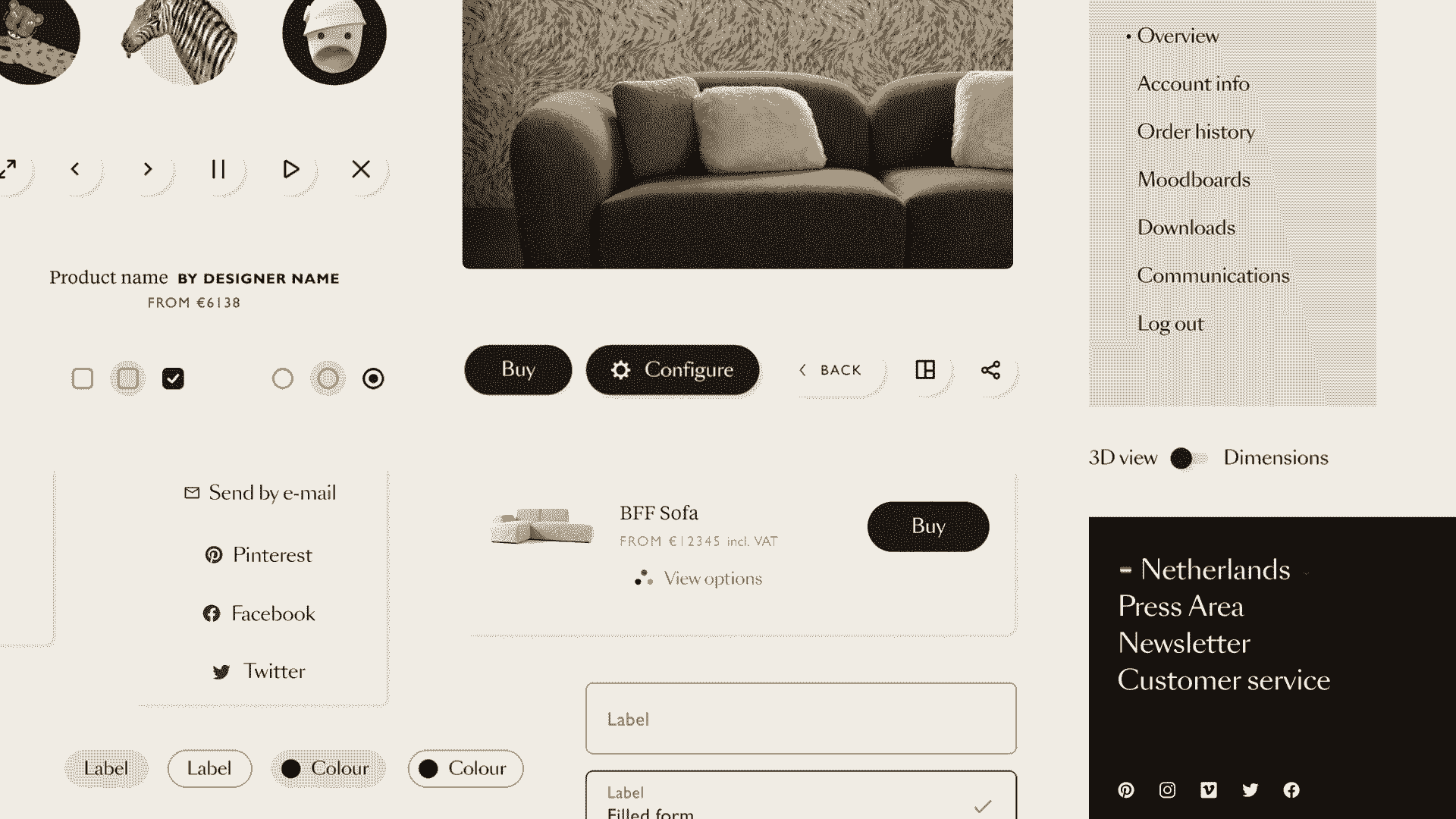
In addition to the classic features of an ecommerce website, you can create mood boards with product photos, you can download 3D files of many products.
We also designed Milan salone, a campaign site to make up for the Salone del Mobile in Milan, postponed to next year. It was developed in six weeks by two developers, starting at the same time as the lockdown; for more details, we wrote a case study.
Just a note on designers who, I think, have an even more crucial role than us, developers, to make sure websites are as accessible as possible.
Close collaboration is also a key to success.
Designs of the site, emails and social networks, the design system and a digital brand guidelines were created on Figma with the Able plug-in.
You can watch a presentation by my colleague Margot Gabel on this project, from her point of view as a designer, although she also talk about development issues.
I must confess that doing things well takes more time and requires to learn knowledge and skills, which is why asking help from experts, at least occasionally, is essential.
Accessibility should not be seen as a feature but as a requirement.
Accessibility cannot be an obstacle to creativity.
By not approaching the WCAG guidelines as constraints but as a chance to learn more about our users, we were able to stay true to our principle of always pushing the boundaries of the industry and delivering an extraordinary experience.
Fin